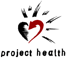
Designed by Steve Lucier of Lucier Design
Key:
- The arrow curving into the center represents Project HEALTH’s efforts to draw in people, energy, resources, and communities into new collaborative efforts. It is active, moving, and growing.
- The rays represent the energy and resources that the families, physicians, and volunteers generate and give back through making a splash or casting out a ripple.
- The heart indicates Project HEALTH’s commitment to the health and development of children and the families and communities surrounding them.
- The final touch is a font that represents a stamp, suggesting that everywhere our programs go, there is an impression made, a mark left.
